

Meet Testable
Services Provided:
- Visual Identity
- Logo Design
- UX Design
- Website Design
- Development
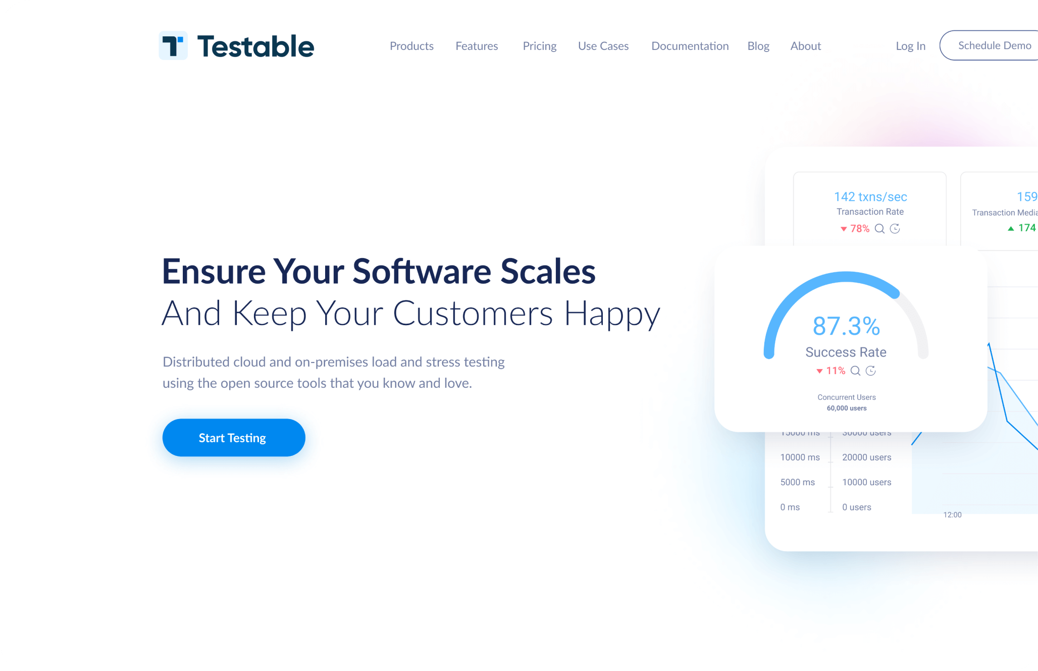
Testable is a fully Integrated, continuous testing platform that ensures websites, apps, and APIs function and perform as intended. By using open-source tools, it provides a seamless experience for testing functional performance. Easy, quick, autonomous.
The web and software testing market is outdated and saturated, with many services being presented to potential clients in similar ways. Visual language plays a crucial role in highlighting brand values and objectives. To showcase Testable’s drive for innovation, as well to elevate them above competitors, we needed to update the visual language and UX/UI while maintaining the feel of trustworthiness.
Convey brand essence and core messages while introducing a fresh visual interpretation. It was important to maintain the recognizability and association with the existing brand, ensuring that customers can still identify and connect with it, while also differentiate Testable within its niche competitors.
Challenge
Goal


Brand Identity
Services provided by Testable require a high level of trust, hence why brand values are openness, convenience, and transparency. With that in mind, we have chosen white and light blue as our main colours. In line with brand values, we choose minimalism as a tool to direct the user’s attention.
Trustworthiness is represented by a clean white layout, while the glowing pink and blue gradients add a touch of innovation and modernity, bringing depth and dimension to the visuals.

#E6F4FF
#0088F0
#172755
#F8F9FF
#0A3751
#55C2FF
Components
Icons


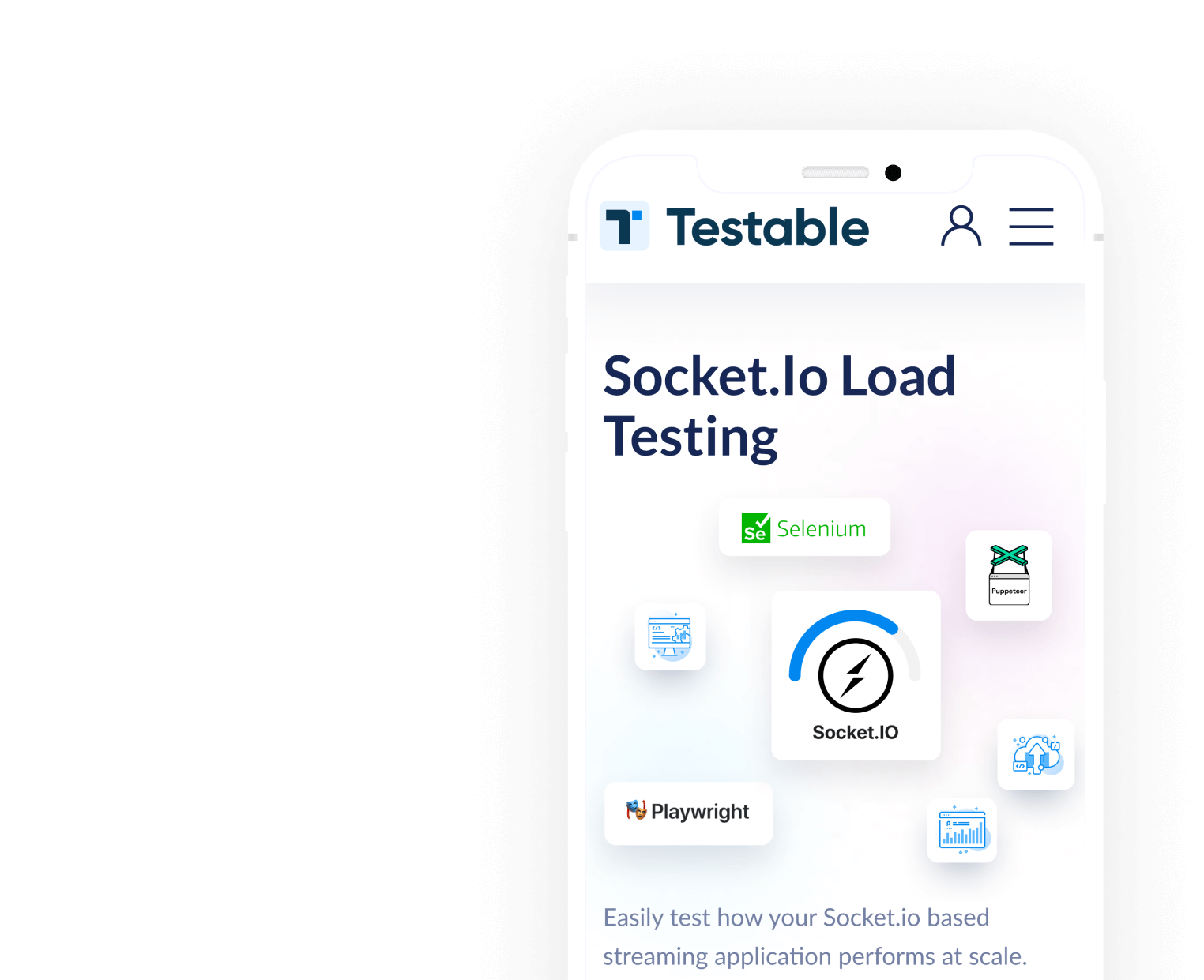
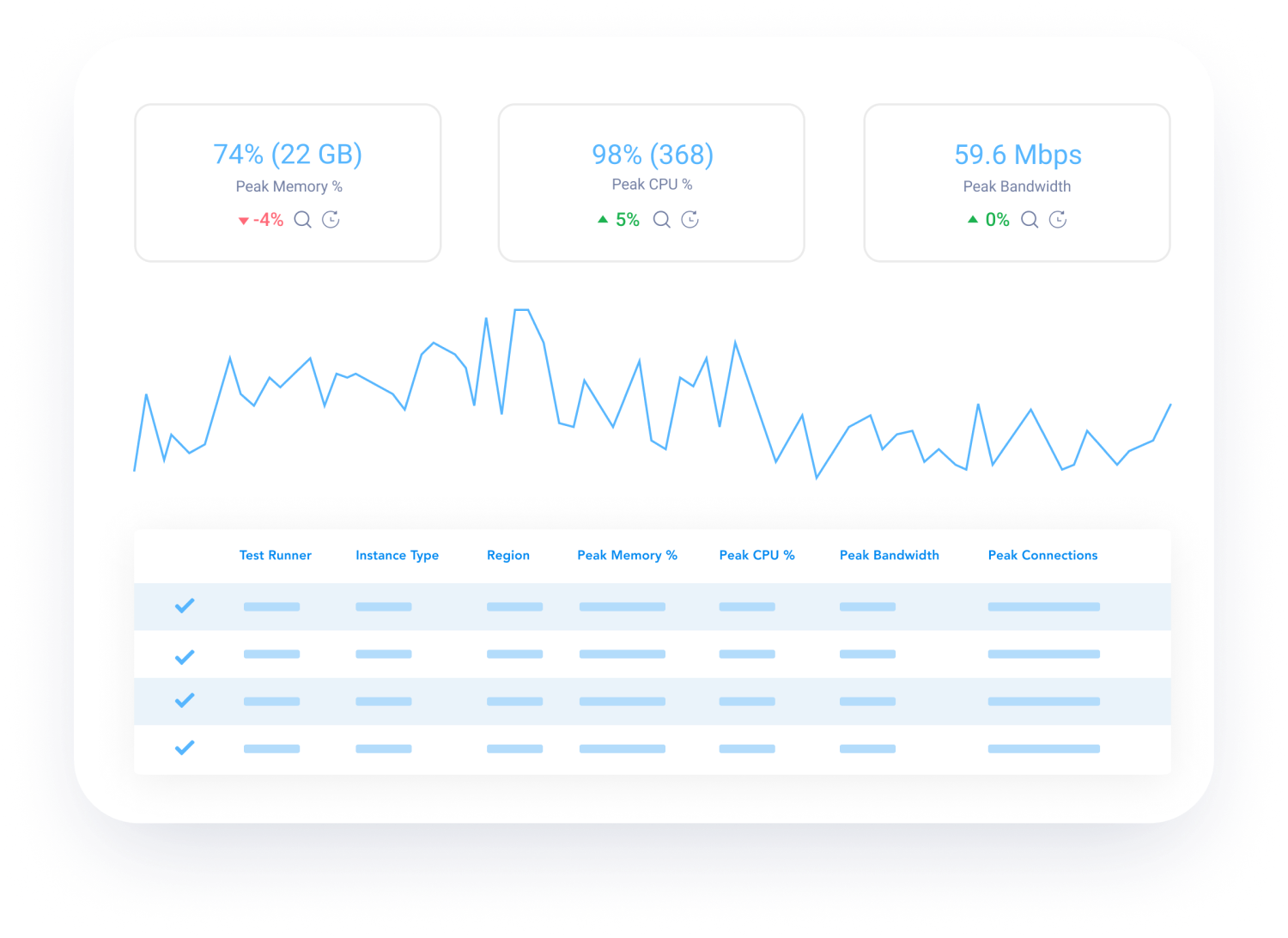
For a user-friendly experience, we integrate relevant images and graphics, easing readers into the complex and technical context of the site while enhancing overall readability.
Recognizing the prevalence of "skim reading," the use of white helps maintain a clutter-free page, reinforcing visual hierarchy and creating a sense of comfort and focus for our visitors. Meanwhile, blue serves as an anchor color, providing stability and grounding to the overall design.


Schedule a Demo
Start Testing
Wireframes
The complexities and quantities of information offered by the brand to their clients posed a structural design challenge. To gradually engage the user, we simplified internal navigation to a static navigation bar with a drop-down menu in the header, allowing users to access different sections of the site while scrolling. By combining a clean layout with a lightweight corporate identity, we have achieved an overall airy appearance for the site.
The desktop grid follows a classic twelve-column layout, while the mobile version uses a simpler four-column layout. To provide potential clients with a sense of ease while reading the complex and detailed information, we have incorporated generous margins on the sides and ample space between semantic blocks.


UX Design
The site contains a lot of technical information that may be difficult for an uninformed user to understand. To address this issue, we have emphasized the use of graphics to convey the main message. Utilizing light and weightless images with clean lines and vibrant colors, we've created a clear and intuitive step-by-step demonstration of the processes, forming the foundation of the style.
To provide further guidance and emphasis on crucial elements, we decided to introduce two gradients, serving as backlights that highlight the most important areas.


The pricing structure within the niche is often ambiguous and complicated, we have aimed to resolve that utilising brand identity to make this process transparently clear.
With the help of tabs that allow potential clients to customise any package and choose the plan that suits their needs, we have made this into an intuitive, quick and easy experience, once again showcasing clients - this is a brand they can trust.


Development
Rather than relying on CMS platforms the client opted to code the website from scratch. This option allowed to minimise vulnerabilities, tailor security measures, and ensure compliance with data privacy regulations.
Adhering to stringent quality assurance procedures, we ensured the website functions flawlessly across various devices and platforms.


I’m looking forward to discussing how I can help you grow your business
Schedule a quick discovery call and let’s find out how we can leverage your design activities


